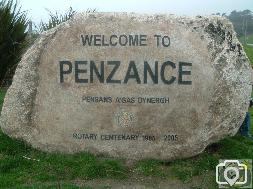
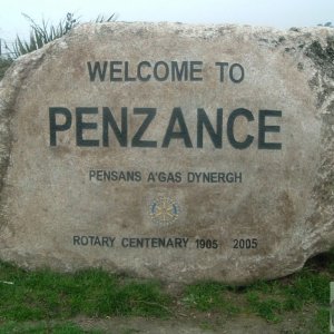
I always think the A and Z should be a fraction closer or the N not quite so hemmed on by the E and Z. Whayever may be the case, it's far better than that lamentable blue thing that purports to indicate the town and our twinning with Concarneau. Anybody from there would take that sign as an insult. It's about time there was something done about it; at least remove it!
In strict layout of lettercarving in stone, you are quite right. To set the layout before instructing the mason, it generally took up to a couple of weeks shifting and re-drawing to get the visual balance correct, with selection of typeface (now called font), height, weight (width of stroke), as well as spacing. Spacing depends upon the adjoining letters and their centreing. After each word is balanced, then work begins on lines of words. (There was one panel in Kent that took a month to get right, twenty lines of text). But this stonework was donated by Rotary, as a statement of the rustic character of the area of Penzance. Looseness of layout is an advantage on this stone; in direct contrast to the formal signs, with lettering laid by machine setting, having no compromise for letter individuality, a representation of the mindless bureaucracy that lies behind them. When dealing with some roadside signs, we were told that permission would not be given, because they would be 'distracting'. Considering the present confusion and disarray, in hindsight those signs we planned would have been a blessing.
This site uses cookies to help personalise content, tailor your experience and to keep you logged in if you register.
By continuing to use this site, you are consenting to our use of cookies.